On Saturday night, Bridget and I went to Hobby Lobby.
We walked straight to the stamp section and found the alphabet in lowercase and uppercase, typewriter font.
We didn’t know if each letter would be small enough to fit on our spines, but we took a chance.
To go with our letters, we got one black ink pad and one white ink pad.
The letters are small, the idea being to decorate our spines with title and author.
I don’t know about you, but we like the way they look.
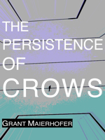
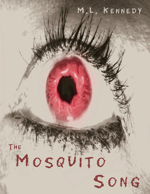
Our new covers are made of textured colored card stock.
We print our Heart of Scorpio and Austin Nights covers using linocuts Bridget designed and hand carved.


Until recently the spines used to be blank: originally we wanted to tend toward minimalism with our new covers, so nothing distracted from the contents, not even the idea of an author.
But, after much deliberation, and the Austin Public Library requiring a title and spine in order to be included in their collection, we were prompted to conform, and we’re really glad we did.

I like the white typeface because, in person, each letter looks embossed.
Bridget likes the black typeface because they’re flat.
Our limited-run books are now not just detailed stories told with their own sense of immediacy, but an actual linocut print.
It’s been fun watching how we grow and change, finding new ways to make our books art objects.
Tiny TOE Press strives to be where writing and bookmaking intersect.